The colour-planned Arctic town
Longyearbyen
One of the world's most northerly towns, where rows of houses follow a designed scheme of warm colours.
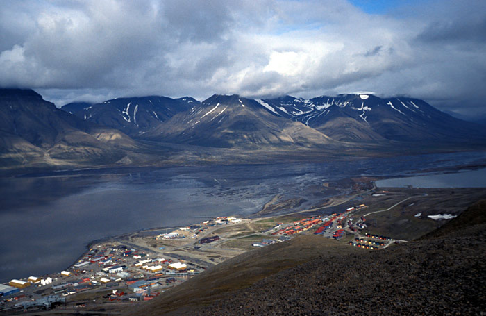
Why Longyearbyen is arctic ochre
Longyearbyen is the main settlement of Svalbard, a group of Arctic islands governed by Norway. It began as a coal-mining camp in 1906. The sun does not rise for several months in winter, and the land around is rock, snow and ice with no trees. From the early 1980s the Norwegian colour designer Grete Smedal drew up a plan for the town. Each row of houses was given colours taken from the brief Arctic summer: ochre, rust, moss green, deep blue. The idea was that the buildings should give warmth and identity without fighting the landscape. The scheme has been followed for decades, and the lines of coloured gables are now the town's best-known view.
Values are fair approximations of what the eye sees there, not measurements.
Colours tied to Longyearbyen
Written by the Rang desk with AI assistance. Background: "Longyearbyen" on Wikipedia. If you know Longyearbyen and we have it wrong, tell us.
More colour cities
All colour cities 🇳🇴 Bergen's Hanseatic wharfBryggenA row of pointed wooden warehouses in red, ochre and white along the harbour of Bergen.🇳🇴 Red cabins of LofotenReineA fishing village in the Lofoten islands where red cabins on stilts stand below sharp grey peaks.
 🇮🇳 City of saffron and lightVaranasiSaffron robes, marigold garlands and oil lamps colour the river steps of one of the oldest living cities.
 🇮🇳 The Orange CityNagpurA city in central India named for a fruit: the loose-skinned Nagpur orange grown in the country around it.
 🇱🇦 Town of saffron robesLuang PrabangAt dawn lines of monks in orange robes walk the streets of the old Lao royal capital to receive alms.
 🇳🇦 The red dunes of the NamibSossusvleiSome of the tallest sand dunes on earth, coloured orange-red by iron, around white clay pans.
Photo credits on this page
The small pictures above come from Wikimedia Commons under free licences. Some are cropped to fit.
- Varanasi In: Marcin Białek, CC BY-SA 3.0, source
- Nagpur In: Gppande, CC BY-SA 3.0, source
- Luang Prabang La: Shelly Zohar, CC BY-SA 4.0, source
- Sossusvlei Na: Anagoria, CC BY 3.0, source
- Bryggen No: Unknown author, CC BY-SA 2.5, source